 |
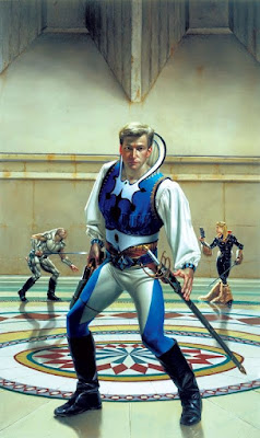
| Art by Donato Giancola |
I'm all for "lived-in futures" and dusty, grubby space Westerns, but I feel like there are some science fiction aesthetics that don't get their due. And I'm not talking gleaming, featureless rocket hulls and silver lamé outfits. I mean the more refined, swashbuckling, adventure film derived style.
Alex Raymond's Flash Gordon was probably the biggest feature in promoting this style, but it shows up in other places like Cody Starbuck by Howard Chaykin:
And in Milady 3000 and i Briganti by Magnus (Roberto Raviola):
It's not really absent from the Star Wars saga. It just shows up more in the prequels than in the original films. I think there's a hint of it in Lynch's Dune and the SyFy mini-series version--though it is sorely lacking from the drear Villeneuve version.


5 comments:
I think a Classic Traveller game can pull this off fairly well.
It has all the tropes: Noble houses, prominence of blade weaponry, Social Standing being a thing, etc. Sure, the starships are more 'Alien' than 'Flash Gordon', and the published art style is also. That being said, How fashion, styles, and culture are portrayed are up to the game master.
I'd argue that some of the best visual examples of this aesthetic at work can be found in the early Marvel Star Wars comics, particularly those released in the post-A New Hope, pre-Empire period. The combination of 70s sensibilities, artists used to working with superhero titles, and a universe that had yet to have its look and feel fully locked down led to some pretty pulpy designs - Baron Tagge and his cape, for instance, or Crimson Jack's barbarian getup.
@Samuel - Good point!
The first illustration appears as the cover of "Deathstalker" series which starts off so good and eventually ends up in repetitive stories where the main characters run the gamut of a weird/horror world.
Indeed it does. I wrote a blogpost years ago about the series that might interest you.
Post a Comment