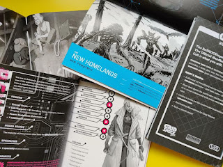
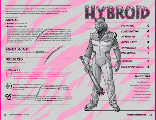
How much does "retro" play a part in the aesthetic of GRIDSHOCK 20XX? We live in a time where cyberpunk is mostly considered a "retrofuture" genre thanks in large part to design that harkens back to cyperpunk publications of the 80s? How much is it a retrofuture as opposed to an alternate present?
GRIDSHOCK 20XX's apocalypse was a reality-warping event that took place in 1986, and its present day of 20XX is set several decades after that. I'd say it's an alternate present, since one of the conceits of the setting is that the existence of superhumans changed the course of history more significantly than it did in your typical "mainstream" superhero universe. The GRIDSHOCK universe's 1986 looked quite different from ours, with things like clean energy and various forms of super-science gadgetry introduced by heroes (and salvaged from villains) in widespread use. So, GRIDSHOCK 20XX's alternate, post-apocalyptic present includes elements from its alternate, pre-apocalyptic past that could be described as retrofuturistic.
In terms of aesthetics, I alluded earlier to having a more retro vision for GRIDSHOCK 20XX that changed as I and my collaborators worked on it. The original over-the-top, exaggerated 80s feel had been toned down a little by the time I published the zines, but that Trapper Keeper retrofuture aesthetic is not completely gone. The 1980s are viewed by some of the setting's factions and characters as a lost golden age, so there's still a good deal of big hair, shoulder pads, and laser grids in the setting. I think those elements help the setting feel toyetic in a way that I hope encourages players and GMs to think big in terms of what do with it.
In creating something and sending it out into the world, it seems to me there's always a bit of difference between what you liked about it and what others do. Is there some aspect of GRIDSHOCK 20XX you really like that you feel maybe folks haven't latched on to or recognized to the degree you would like?
I think those who have picked up GRIDSHOCK 20XX really like the look of the zines. That's gratifying to hear, because the aesthetics were always a focus for me. While I've had people tell me they think that the setting is awesome or interesting, so far, I haven't heard much about specific elements of it that they particularly enjoyed.
This is my first foray into writing for tabletop RPGs, so I'd love to know which parts of the zines readers liked most (or maybe didn't like as much) so I can make more of what works well for them. For example, I'd be interested to know if people enjoyed zine 3, Regions, as much as I do. I think it presents a lot of interesting, gameable material in a small package, but did others feel that way? Did they love the landscape format of that booklet or hate it? I'm not sure yet.
Hopefully you'll get some of that feedback! Last question: Where do you see GRIDSHOCK going (or where would you like to see it go) in the future?
There might be additional GRIDSHOCK 20XX zines, including adventures, adversaries, or new regions to explore. I think games often live or die based on whether they've got some solid adventures ready to go, but I'm not especially skilled at writing them. I've considered working with other creators to make that happen.


No comments:
Post a Comment