

This is a hypothetical Ballantine Adult Fantasy series cover for Jason Sholtis's upcoming Operation Unfathomable. I based it on the cover to Hyperborea by Clark Ashton Smith published in this series in 1971. I picked this one because the cover image had some similarity to an image Jason had at one time considered using for the upcoming project and I was pretty sure I knew what the typeface used in the header was just by looking at it: Futura. As you can tell, I didn't have quite the same font they used (I used Futura Medium BT), but I didn't need it to be exact. The Unicorn logo I took from this cover. It isn't particular the cover I would make for Operation Unfathomable, but it fits the era and look of those paperbacks.
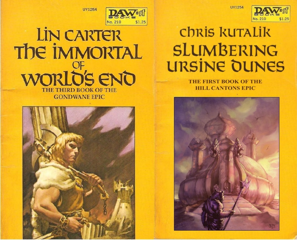
This one is a Slumbering Ursine Dunes cover based on the DAW paperbacks, specifically on the Gondwane series by Lin Carter. I picked the Gondwane series because it used the cover image was inset in a yellow border which was easy to work with. I matched the typeface with Font Matcherator, and it turned out to best match was Solemnis (sometimes called Solemnis Regular). What's interesting is some letters have different capital and lowercase glyphs in different versions of this font and not in others. The DAW paperbacks show this because the Gondwane books have different "T's" than what appears otherwise to be the same typeface used on the cover of the Years Best Fantasy Stories. Also, some freebie versions have more variations between uppercase and lowercase characters than Berthold's "real" version. Anyway, it required mixing lowercase and uppercase letters to get the look of the Gondwane books--which left room for me messing up the "e" in "Slumbering." If often takes me more than one try to get things "right."
I did another one of these for Fever-Dreaming Marlinko in the DAW Gondwane style. It's the same except the lettering is red is in red.
I certainly don't claim to be any expert with image or vector editing software, but I can get results I'm satisfied with. See more of my fake covers here.


3 comments:
Good work and fun to look at. Ah, Daw Books, takes me back . . .
I've really been enjoying all of your alternate covers!
Those look fantastic.
Post a Comment